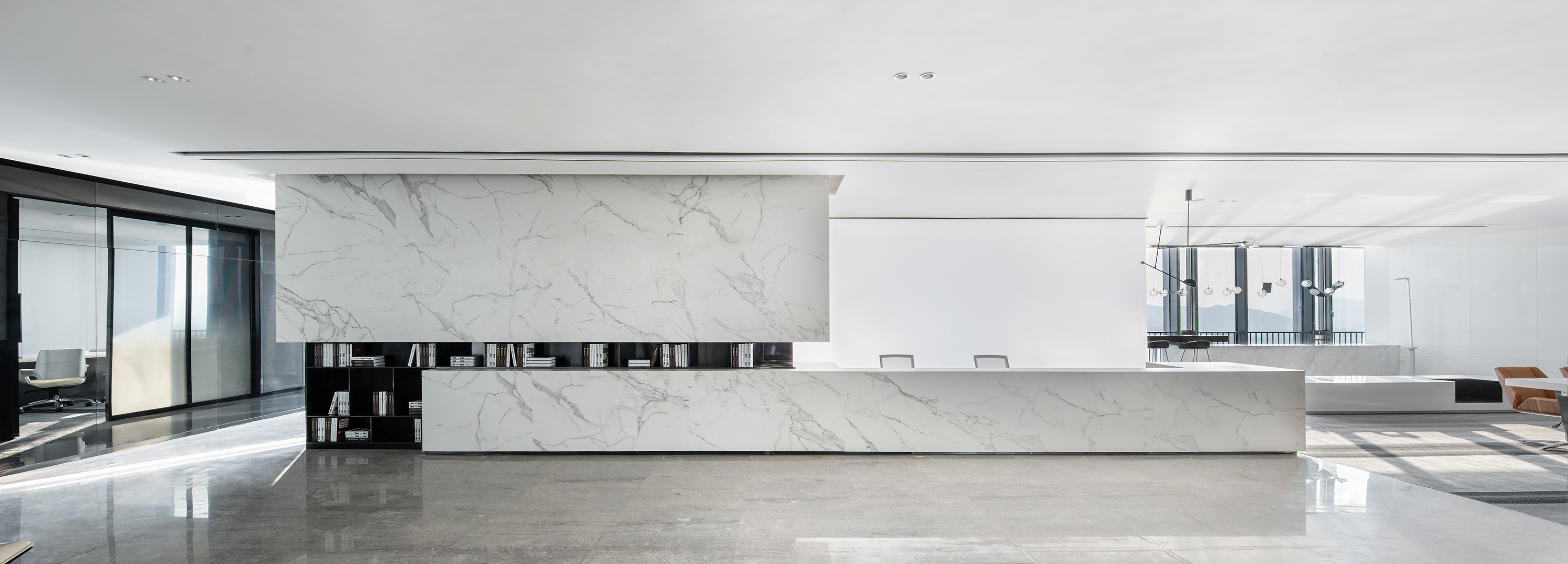
综合环境和人文的需要,在呈现空间状态的设计中,设计师不纠缠于琐碎,而是大刀阔斧利用重新建构的框架的基础面形成的线条作展开。在色调上,设计师以白为基调,以材质赋予其形成微妙的异同状态,利用光的变化和重颜色的点线丰富空间形态。设计师在设计过程中,将空间当作一个素而稍显斑斓的观景空间加以考虑,使用适量的绿植穿插其间,以与户外天然作情态上的呼应。在空间结构重新整合之后,呈现出抬头即眺远,在使用者心理层面唤起“天光云影”的印象,调节使用人士在该空间的心理状态。
Considering the needs of both the environment and humanity, in the design that presents the spatial state, the designer does not dwell on trivial details, but boldly unfolds the design along the lines formed by the base surface of the reconstructed framework. In terms of color tone, the designer takes white as the keynote, creates subtle similarities and differences through different materials, and enriches the spatial form with changing light and dark-colored points and lines. During the design process, the designer regards the space as a plain yet slightly colorful viewing space, with an appropriate amount of green plants interspersed to echo the outdoor natural scenery. After the spatial structure is reorganized, users can look far away as they raise their heads, evoking the impression of “skylight and cloud shadows” psychologically and adjusting their mental state in the space.


 PREVIOUS